 This past week I was onsite with a client to review their site requirements and visual designs that had been created. My biggest focus was to try to determine how much additional effort would be required beyond what we could accomplish by implementing Keystone out of the box.
Having talked through the wireframes and designs, we had a fairly good idea of what the client was looking for from a front-end experience. Now it was time to try to use Keystone for a new use: interactive wireframes!
Creating the wireframes
Armed with the designs and static wireframes that were created, I accessed my local Keystone installation and began the process of validating how much of the design could be accomplished with out of the box components.
The following steps can be used to perform a Keystone wireframe exercise to validate deltas with the design:
- Create a new site definition.
In my scenario, I wanted a new MVC site. After using the MVC Site branch template to create the sample tree, I added the site definition to the Multisite Manager configurations.Note: Remember to set BOTH the root path and start item to match to your site or some Keystone elements won’t be able to determine what site your page belongs to!
- Edit Home Page in Experience Editor.
You’ll want to be able to start with your home page and validate you have the components you need for what is undoubtedly the most complex wireframe in the design. - Create a sample landing page.
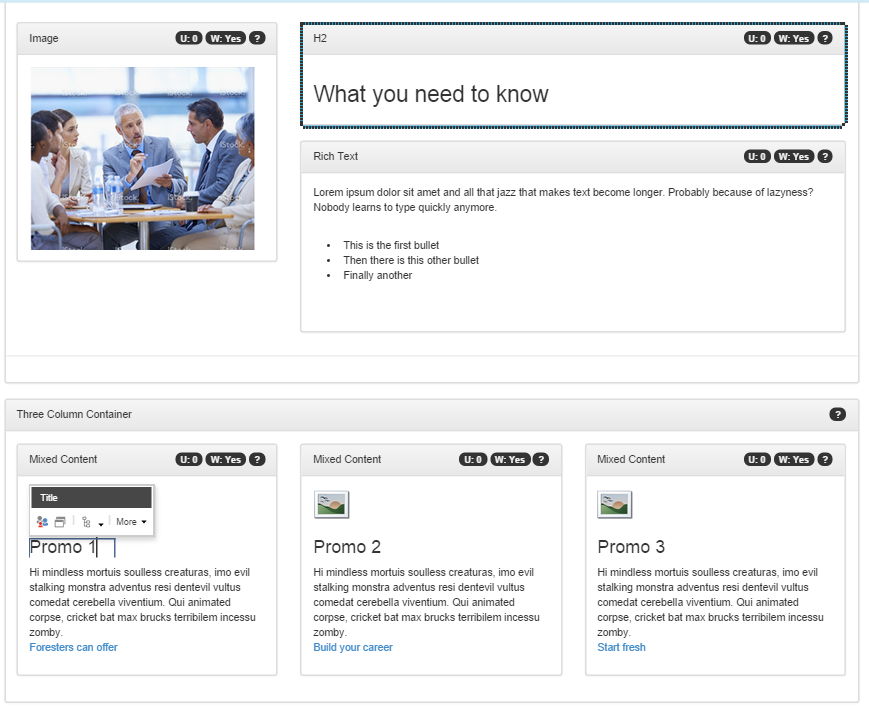
Create a content page below the home page in the content tree using one of the available Keystone layouts. Choose the one that best matches to the overall page layout in the design.In my case, there was no side navigation, so I used the one column layout template. - Start adding grid layouts.
With both the home page and subpage, begin adding column containers to the pages to create the basic grids that make up your designs. You might have a wide one column block at the top, followed by a four-column grid with calls to action. By defining the grid layout, you can make sure that the design that was created will be supported by the available column options. - Try out some common components.
In the grid layout, start adding components to represent the elements of the design. You won’t have the right colours, or sizes, but in general you’ll be able to convey the concept of the design.Common components you will likely use would include the title components (H1, H2, H3, H4), the mixed content component, the image component, and the simple text component. - Look for missing elements.
Are there elements of the design that can’t be represented with the simple components? A video integration? A listing of events? A twitter feed?You may need to try out the existing scripting and social components to represent these. The Rich Text component can also be used to represent more complex content elements.
Review and determine missing authoring functionality
With the Keystone wireframes in place, you now have to validate a few things on the authoring side. While the variety of components available can be used to mock up the design, the components used may not reflect the desired authoring flow. Here are a few things to review with the team:
- Content grouping.
Are certain elements of the page meant to be grouped together? Such as a title with an associated block of text and a call to action button? The Keystone wireframe may have used separate components to represent these elements, so a custom component or content block may be required to urepresent these. - Personalization needs.
Are there any sections of the page that need to have personalization applied to them? If so, that area probably should have a single datasource and not be split across multiple components. This may require a custom component or content block to represent these. - Governance requirements.
Now that we can see the authoring flow for a page, are there any specific rules governing who can edit which part of the page? Do some areas require different workflow approval than others? Keystone has a default page and component workflow, but it may not match to the specific business needs for approval of some content.
Review responsive design
Since Keystone components are built with responsive support, the wireframes can also be used to quickly review the design’s responsiveness without needing to build out an HTML mockup of the design. This is particularly helpful reviewing the grids of the page to see how the content will stack for mobile devices. Here are a few things to bring to the team’s attention in order to validate if additional changes may be needed:
- Interactive behaviour.
Are interactive elements such as accordions, carousels, and tabs providing the desired end-user experience at mobile resolutions? Is an alternative interaction model desired? - Stacking of design elements.
Is the content stacking in a way that makes sense for reading the content? Sometimes the content will have images placed in a way that makes sense for a desktop view, but when stacked it loses the meaning or association to the relevant content. - Navigation.
Is the default mobile navigation provided by Keystone working with the content copy provided in the designs? This is often an area where clients may want a specific navigation experience.

What’s next?
After reviewing the interactive wireframes, you should have an idea of any customizations that need to be built into your solution. Usually, this would involve taking existing Keystone components and creating new versions with added functionality or fields.
Also, for some clients, reviewing the interactive wireframes may not be enough to provide approval of the approach. Applying some front-end styling with CSS and jQuery customizations will make the components appear more like the official design and will allow reviewers a better idea of what it will look when the site goes live. You should only do this if budget and time allows, however. Otherwise, you might want to save this for the first sprint and show it during the demo.
 St-Cyr Thoughts
Leave a comment